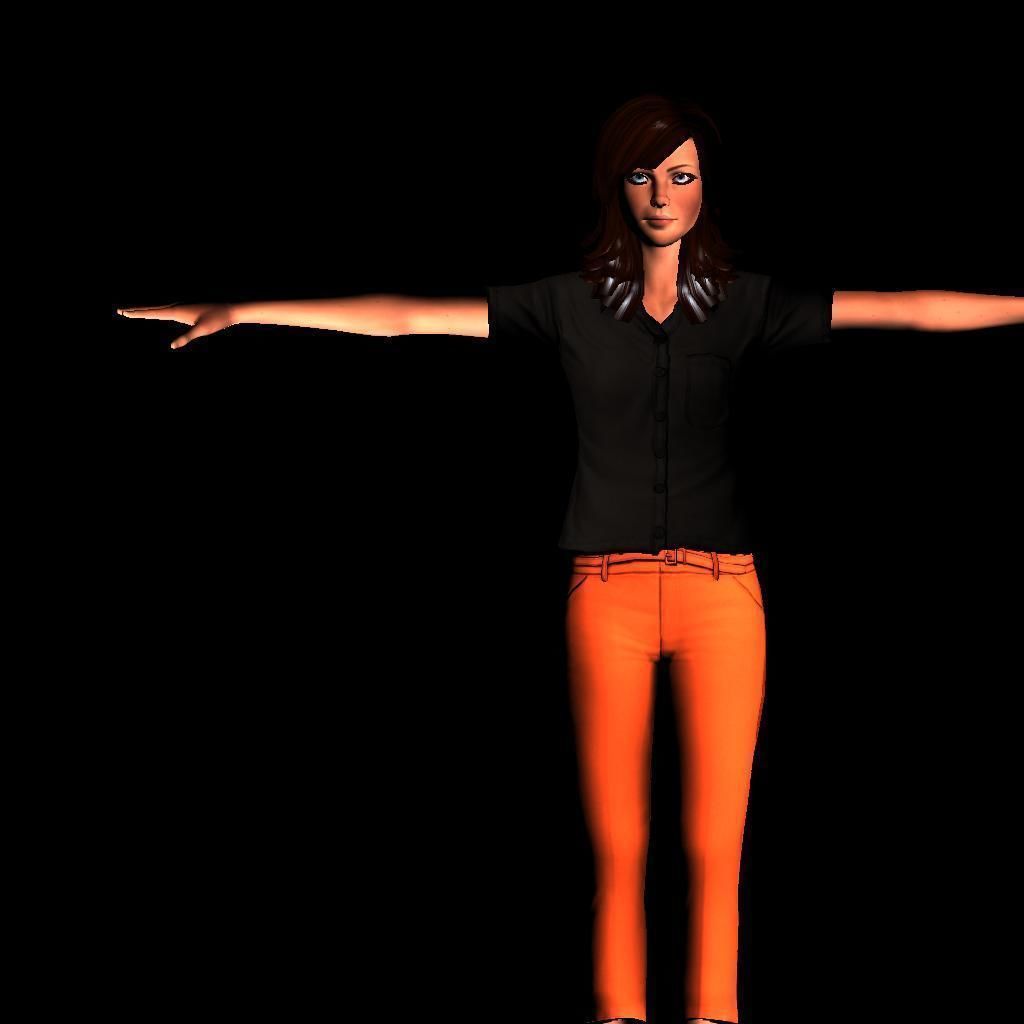
Feel free to give me any sort of advice
Is it Right??Does anyone else do this and if so,How do you feel afterwards??
Hey Guys
I'm a CGTrader user that go by the name ZaapiZoop (Silly,but it works)
I normally create realistic human characters and whenever i upload a product i always use the same layout and that layout is the one below with 4 pictures
1st picture is rendered with Arnold Renderer and it shows the character next to a big "Rigged" sign (To let people know that the product is rigged)
2nd picture is one where you can see all the joints of the gaming rig (A rig made for games and it's easy to import and won't cause any delays in whatever game engine your using).I got this one image through "playblast", you can find it in autodesk maya
3rd one is basically the first one without a "Rigged" sign
The 4th and final one is the Animating Rig (For animating and can be extremely helpful when it comes to time and has easy control that anyone could get use to or change/adjust if don't like it).You can see anything from the knees up to the face-rig in the image.
*Take a look and the read then next part under the pictures*


I was ok with this until last week when i decided that i have had enough with it (Reason: "lack of customers")
I decided to change stuff around and i went around my profile changing anything from the picture line-ups all the way to the descriptions.
By the way my normal description goes likes this
"This is high quality model with animation friendly topology.( simple overall structure)
Full Rigged with over 24+ facial blendshapes and 20+ skin morph targets in order to produce better rig quality and remove all joint issues such as overlaped knees, stretched hips, etc.
Model is suitable for use in broadcast, film, presentation, cut scenes, advertising, etc.
All geometry and textures can be used in any type of 3d apps. Such as Maya, C4D, LightWave, Marmoset and current gen game engines (tested in Unity5, UnrealEengine4 and CryEngine) "
But now only a few products have this description left,i have changed the rest around here and there.
Anyways so 2 days ago i uploaded a new layout and this one had more colors and just looks better in general.
*Take a look and the read then next part under the pictures*


Although it looks more realistic and colorful i just can't seem to like it and you might be wondering why i decided to keep it that way,well it's simple...It sells.
I hate it but more customers like and my reputation scores are getting higher from people liking it and/or buying it. (Like seriously more than 90% of all the visitor have bought it and not many have even visited the product).
I hate it even though it looks good to the customers and i can't bring myself to delete it or change it because then maybe the sales may decrease and go back to normal,So i haven't changed it but by not doing so i feel like im a sell out because im not doing what i like instead im just doing whatever brings customer and traffic.
These thoughts make me feel sick and i just don't know what to do,i've uploaded 2 more models and they have a similiar but not identical layout.
so "Is it Right??Does anyone else do this and if so,How do you feel afterwards??"
Answers
The second lot that all contain the RIGGED tag are much, much better as they give the customer a better overall look at the product. Id recommend adding wireframe renders too to give the customer an idea of the topology of your model too.
At the end of the day, youre selling asset to a customer and if the new render style works better than the old one then go with what works. Otherwise the work your putting into the models is going to waste.
Your answer
In order to post an answer, you need to sign in.
