Some people like to highlight that all the glorious art has already been created. Those who say so perhaps forget to count in the endless possibilities of 3D design. Today movies can be filmed in a quarry of stone and 3D designers will add the turquoise sea, verdant pinewood and a surreal house on the shore.
The audience could suspect a house being improved using 3D design technique. But it is much easier to bribe with a landscape selling a matte-painting as the real one. Moreover, 3D designers are passionate to confuse questioning: What do you think: is this a photograph or the art of 3D?
This phenomenon is called photorealism. It is like a magic wand that brings a fantasy into the life while is used by a skilled artist. Obtaining render which is indistinguishable from a photograph became the Holy Grail of 3D design since 1960s. The target in this work is to reach perfection. In this particular case it means to imitate the reality to the smallest dots. It requires high level of attention even to the rarest details.
So we want to share our thorough list of the highly professional 3D artwork of photorealism. Hopefully, it will give you new ideas and inspire for the masterpieces.
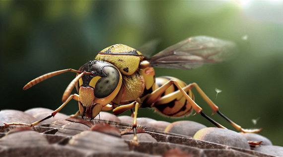
A Vespid
Kuan Fu Sun says that it took 30 days to finish a render of a vespid, using 3dsmax, Zbrush and Photoshop for post production. It is richly detailed from the tiniest parts of an insect such as body hair or the net of eyes to the floating bits of dandelion in the background. Daylight illumination and strong depth-of-field makes you feel the macro scale of a scene. Also precise textures of wings adds the final touch to realism in this image.
Here is a making-of of the render.
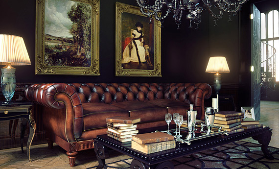
Interior is something what surrounds us everyday. This classical interior 3D scene has all the elements and tiny details needed to fool a human eye. Accurate textures with extremely balanced shading and lighting of this rendering left us in awe. Benjamin Brosdau has completely achieved the same feeling of excessive, stylish richness that can be associated with 19th century classic interior design. What once appeared to him as a modeling task to get a famous chesterfield couch done, ended up becoming something much more complicated.
Bits Of Bread
All around the web this render by Bertrand Benoit is accredited as the most realistic one depicting our daily bread. Moreover, it indeed makes you hungry as hell. The author tells that he found a niche of rendering baked products almost accidentally. After a while he made a decision to build a small library of baked, carb-heavy assets. So he shared some of the results with a community of 3D designers and left them speechless. Bertrand Benoit is extremely accurate with the textures and as a result it is possible to feel the warmth of a loaf of bread.
A detailed and illustrative narrative is provided by the author.
The Classroom
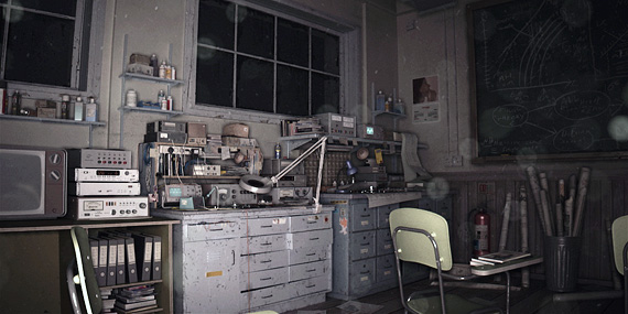
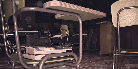
Meny Hilsenrad, "Studio Aiko"
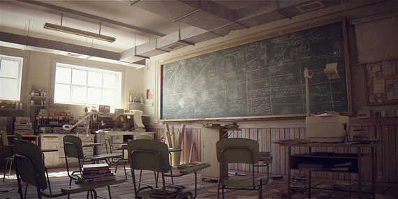
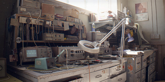
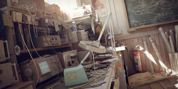
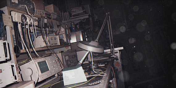
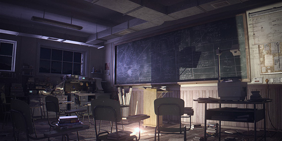
This is a possible future project of a design studio Aiko. Their original plan was to create a classroom environment from different camera angles that overlooked the entire classroom. Of course, later it turned out to be a highly challenging project: they went into much more complex work. One classroom has four different stories covered in separate lighting versions: daylight, night, sunny day and camera flash. Each contains precise details and high level of realism which does not blur even in the light of camera flash. Many of 3D designers use this idea as an inspiration for the generation of ideas. The team of Studio Aiko says that this project was done with a lot of love and dedication like no other.
Project's making of is provided on vimeo.
Everything Beautiful Is Far Away
Marek Denko is the 3D designer who fell into CG world when he was 15. Since then the artist stands for realism, details and perfection. This render reminds photographs made with Soviet film cameras: deep and somehow nostalgic. The author says that it took too long to finally finish this work: there were periods when he even could not look at it. A concept of this render is about being far away from everything you love. Marek Denko thinks that the airport is an exact place to feel that loneliness while walking unpersonalized between Duty Free shops and fake Irish pubs. Nevertheless, it was published in the 6th volume of Digital Arts Maters book series.
Eldorado
This was supposed to be a commercial product. But... Ready-to-use 3D model of soil was left for the Marek Denko. So he kept the scene and professionally used it for the personal project. He mentions that he was not sure what will be the hero of the shot. An idea to use a toy came to the designer's mind when he started finding toys he brought for his son from L.A. All of them were scattered around the house and garden: almost destroyed. Marek Denko found one of them. It was the 1953 Cadillac Eldorado. That's how the author found a hero. But this is only a story behind. A process was much more difficult, asking at least few hours a day and 7 hours of rendering.There is available retrospective of Marek Denko's artwork on vimeo.
Old Lamp
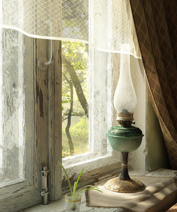
There is a saying that the very first attempt usually fails. Then this render is an exception of a rule. Old Lamp is the first still-life image Andrey Zhelem has ever made. Firstly, he had an idea to create something old, but also sweet at the same time. And suddenly he got a picture in his head of a simple, but stunning still life render. He needed 7 days to reach his own limits of perfection and to finish it. Then it took only 1 hour of rendering to see these touching results.
The author also shares a tutorial for 'Old Lamp'.
You're Goddamn Right!
Riccardo Minervino works in the game industry, but never refuses experimenting. 3D designer has created a set of extremely photorealistic portraits. This one introduces you to Walter White aka Heisenberg from TV series Breaking Bad. At first, this 3D model was sculpted in Zbrush in just two days and later it was rendered in Octane. To render a portrait is a highly demanding task. It not only requires a precise work with outlook, but a designer must make the character alive providing him particular but concrete features.
You can also find making-ofs of his artwork.
It Was You
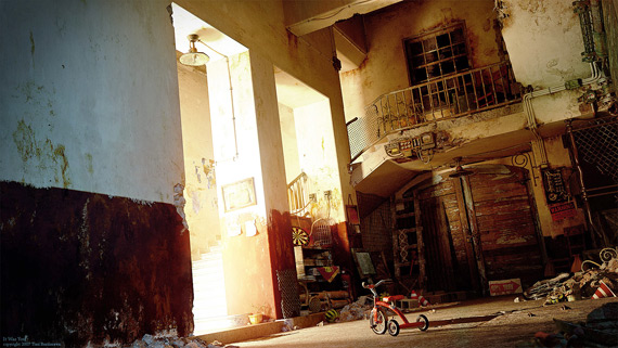
Tricycle. This render like a time machine brings everyone to the childhood. It was an intention of the author. He says that it is a reflection from his early memories. It has appeared as a picture of Polaroid in designers mind: a coming render had to be as realistic as possible. Colour effects, abandoned things, old house, some light coming in, litter and windows without glass: all of them create mysterious atmosphere, awaken feelings and emit reminiscences. This work is dedicated to the authors wife. Moreover, it was awarded with CG Choice Award and CGhub Gold Award.
Street 13-26
Grzegorz Wisniewski
A street view is a very common for most of us. The designer started creating this render only as a texture test, but he says he could not stop working on it. So the author decided to turn it into a complete scene. The hours he should have been sleeping gave the result. This object reminds some areas of a hometown to the author. He sees it as an old building waiting to be pulled down, but it still has people living inside. Personal project Street 13-26 was given an award for excellence on 3DTotal.com, 4 stars on CGTalk and published in number 7th of Render Out magazine.
Camera Vintage
Most of the 3D designers work for the companies. But when they have some free time, they sit in front of the computer again and then work for the personal projects. It took three days to finish this Vintage Camera render. The name of camera almost announces: Brilliant this artwork looks so too. The designer was able to convey its age and to create a breath-taking reflection of a window in front. Moreover, he is experienced with the textures, so it helped him to expose all the smallest bumps and dust which makes this render to look as a real photograph.
Lost Highway Wind
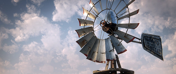
3D design works of this artist can be easily characterized. They are highly realistic and the author uses similar tones of colours and renders objects driven by inspiration. Some of them come from other artwork: paintings, movies, books. Others are associations of the everyday life. This render is a frame of Gustavo Groppos upcoming short movie "Lost Higway". There is also a video with a moving model. I guess simplicity is exactly what attracts in this creation: I am given a feeling of Wild West and almost can see a windmill turning.
The very first shot of the author's movie "Lost Highway" on vimeo.
Once upon a time
West of America is a dream for almost all American males. The inspiration for this render came straight from a Hollywood movie "No Country For An Old Men". But the designer had to wait a bit to fulfill this vision and express his inner energy. A trip through Arizona's desert was a final for that. Despite the fact that a plot of a movie takes place in Texas, Gustavo Groppo set a scene in Arizona. To tell the truth, a render really has a strong flavor of the Wild Wild West as the other artwork of Gustavo Groppo.
Ice Environment
Gerardo Gerard is a 3D artist, who specializes in matte-painting. He usually chooses powerful, but demanding landscapes. There are rainforests, abandoned and destroyed cities and ruined underwater civilizations, conspiratorial and extremely cold environments. Most of us have never seen such a view, but somehow a freezing cold can be easily felt. The author created an entire palace of ice with graceful but strict lines. A position of sun is highly important for this render and the soft colour of lighting makes a model less stark, but more realistic.
Here is a making of for this render provided.
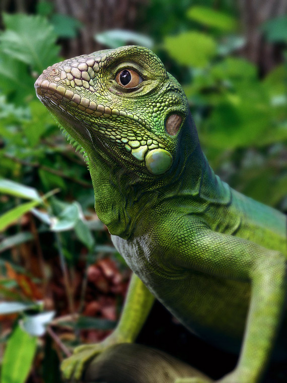
Green Iguana
Wild life photography astonishes almost everyone. Wide and unusual angles give an opportunity to observe that secret world from a closer perspective. But Xiaodong Li captured one moment of iguana's life, using 3D design technology. Lush colour, detailed squamae, delightful wrinkles of the skin and alive eyes: provide almost the perfect quality of a render. Moreover, it looks not only photorealistic, but a reptile seems to be given some human features also.
If anyone is interested, the author provided a making-of.
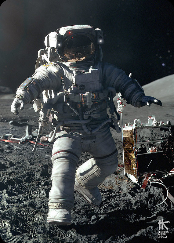
One Small Step
I truly believe that every work should find its time. Tomas Kral says that he hardly had any time or wish to start working on this 3D model for a long period. He was asked to create a modern astronaut suit with high leveled details by other designer. So that asset was just lying down in his hard disk, while one day he decided to play a little bit. Out of this he got a result of "Space Waltz": astronaut being eaten by a jelly octopus. Later he updated a render to the "One Small Step". It took three weeks for Tomas Kral to finish it. After that he dedicated this model to the legacy of a recently deceased Neil Armstrong.
Tomas Kral has provided a making of for the interested ones.
Winston Churchill
It seems that Tomas Kral likes to involve famous characters into his 3D design scenes. Time for Sir Winston Churchill has come. The designer created a caricature, displaying him as a bust just standing in one place and observing the world around. The character definitely minds his own business, while he is cruelly attacked by the pigeons. Maybe a bust of W.Churchill is not very common in the streets of London, but pigeons on the sculptures is something all of us have seen. Of course, this is not what makes this render photorealistic. Tomas Kral managed to convey a texture of a particular material, every single crack is clearly visible and a pigeon is so relaxed. As always.
Tomas Kral has provided a making of on his personal website.
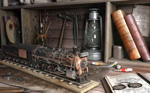
Prototype
Denis is an extremely talented 3D designer. According to him, everything he knows about design and art came from the books and internet lessons. He has no artistic education and sometimes feels a lack of it. There should be an eye of expert to notice that lack, I guess. Nevertheless, the designer is interested in everyday scenes such as one in the "Prototype". While creating that 3D model Denis was experimenting with various textures that help every artwork to look realistic. This one was given few awards by American and Russian portals for 3D designers. He was acknowledged for the excellence and concept and published in a book "Arqute".
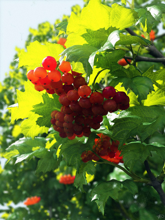
Apricus Acini
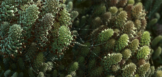
Denis Tolkishevsky seems to be genius in simplicity. The designer managed to create an absolutely realistic render which possesses only one detail betraying an image to be 3D design. Yes, it is a spider's web in a corner of a picture. When it comes to an object: textures are perfectly detected, berries are purely translucent and leaves are almost touchable. "Apricus Acini" render has received four awards on Russian websites for 3D designers.
Stages Of Light
The designer Jesus Selvera got an idea for this render while experimenting with a lighting. He tried to capture different light from a single still. The texturing was made by the author from scratch. Most of it was hand painted to create diffusion, reflection and displacement map correctly. Surprisingly, all the models in this render have reflections even including the walls and mud. It took 3 months for the author to finish it. Moreover, each of a render required 4-5 days render time. Jesus Selvera says that there are 12 million polygons in this artwork. I even cannot comprehend that number.
Here you can find the full his project attached.
A Glass
This artwork is peculiarly simple, but fascinating. Despite the fact that you can distinguish it from a real photograph, it is greatly realistic. When you look at it, you see a million-times used glass inherited from your grandmother. It was an experimental rendering of glass using NOX renderer, but it became more than an experiment. All the tiny and accurate cracks and splits are the reason why this render appeared on this list. The author has attached scheme of used material and wireframe.
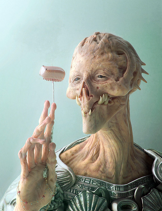
Inter-dimensional Predator
An idea to generate this strange creature came after Greg Petchkovsky and his friend decided to challenge each other making an "inter-dimensional predator". The goal of this was only fun and practice. Neither of them has really finished it, but were highly inspired by the technique the other has used. This render is greatly inspired by a painting by Dave King and Japanese sculptor Takayuki Takeya. The author reveals that each eye of render is made from two spheres: a small one with the colour, surrounded by a slightly larger one that is refractive and has fresnel reflections. In addition to this, the smaller sphere is flat in the iris area, while the larger one bulges out a bit to form the lense. Unsurprisingly, the picture has received a "CGChoice Award" and master award for 'portrait-render' from EXPOSE'4.
Greg Petchkovsky shares a wire of a render.
Ecosystem Simulation
I noticed this render firstly because the topic is revealing. Ecology is a painful mainstream discussion topic nowadays. Moreover, this work is a whole project following the idea of Fibonacci sequence. It means that Arkadiusz Rekita started this project seeking to create procedural plants model which sent themselves information and formed in a such a way so that in a result they make one organism. It works as ecosystem in which every plant, every leaf and fruit has its own non-incidental place. A render creates an impression of photorealism firstly because of the spider web with tiny drops of water. While exploring a view, you realize the plants to be so punctilious that you even believe them to be real.
Here you can find the whole project of Arkadiusz Rekita on ecosystem simulation.
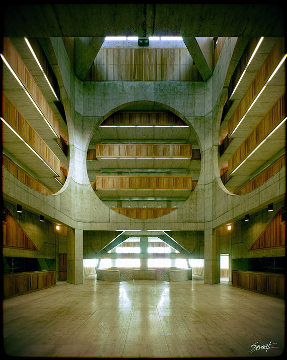
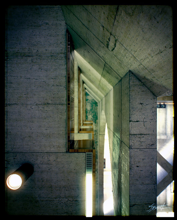
Phillips Exeter Academy Library
A father of this building is Estonian architect Louis Kahn. He built and designed it a few decades ago. An artist is Alex Roman's favourite architect and the designer has always wanted to reproduce Louis Kahn's masterpiece. After a long period of studying, he finally did it. Alex Roman tried to avoid books in the shelves of 3D designed Phillips Exeter Academy's Library in order to provide more raw geometrical space. As he says he playedaround a little bit with volumes, lighting and materials. All in all the author spent almost 2 weeks scratching. Most time he was drowned into mapping and textures work. Each shot took 1-2 hours of work, Alex Roman says. But we see results of it and the fact that he has created one of the masterpieces of 3D visualization. These are only few shots from the full 3D animation.
Old Violin
A bunch of renders on this list were made by the experiment. This is one is not an exception. It was a godforsaken room which inspired Francesc Camos to examine himself in texturizing. He tried it with different types of materials: wood, metal, paper, glass, plastic and even fabric. The author created the nostalgic atmosphere and definitely blew a breath back to that room. There is only one small detail that catches my eye: a glass of a lamp is quite too new and too transparent. Nevertheless, this render does have a spirit.
S&M
A young 3D designer Shd Denis said only one sentence while publishing this render. He treats it as a small 3D project with a soul inside. Indeed, there is one. This 3D model is quite extraordinary. There are millions of ways to choose how to create a render of a beloved women or muse. But the artist chose to construct her from the wires. It makes a render highly realistic, but at the same time surreal also.
I Am The King
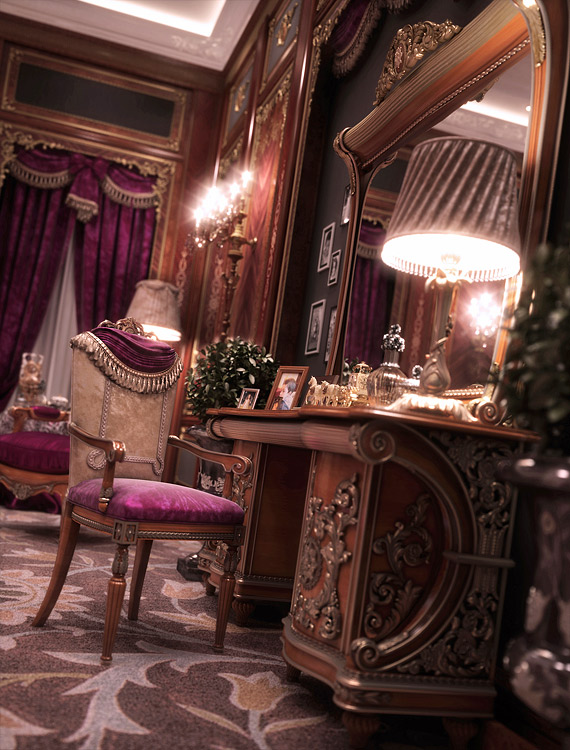
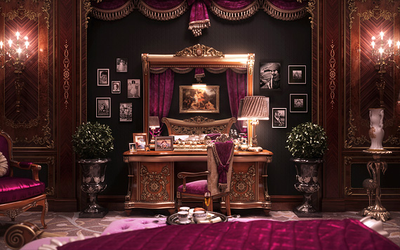
Walid Layouni was inspired to create an extraordinarily luxurious bedroom, where I guess only the real king could sleep. Some people are not attracted to live in the museums, indeed. Like it or not, but this render possesses a high quality of realism. The author was very accurate trying to preserve the value of small details on the decorative panels. He says it was important to make a visual mass balance for the space. Walid Layouni thinks that it is mostly nitpicking. While his render look as a gorgeous fantasy, I found that the real framed pictures bring me back to the reality.
Author provides making of for those who want to render their fantasy rooms.
Lemons
Monika Olizarowicz, Tomasz Wyszo?mirski
The idea of flying fruits or vegetables is not that new: we find it on TV or food advertisments. But there is no need to say 'no' to yourself, when you realise that you are inspired to create a such render. The fact is that realistic food in the images definitely makes us hungry and that is why it is powerful. The authors of this render created the whole collection of flying food: red-faced tomatoes, redolent coffee beans, juicy blueberries and blackberries and healthy apples. Water drops on fruits and vegetables provide an impression of freshness and realism. There are some rough details left, but the crew without any doubt sold a render.
They share healthy apples rendering making of on vimeo.
White Bedroom
Jurai Talcik, Veronika Demovicova
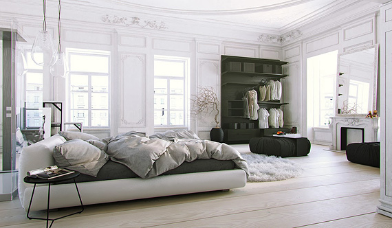
The authors say that origin for that scene came from an ambitious project to create complete classical appartment, renovated and filled with furniture in highly modern style. In that room they wanted to model everything what is possible. It was five days hard working and Veronika has created the most advanced 3D bed done to our knowledge. Individual stills needed rendering on average for 9 hours at 3000px. All in all, they were working on this project for more than one month and half. Render reveals that they thought about everything: appropriate lighting, every single detail of the interior, correct adjustment of colours and rational reflections. Maybe this room is too clean, but I know how easy it is to mess it up.
The designers share a full 3D animation, containing a tutorial.
Two At The Carnival
Masquerades always spread some magic around. There is no doubt that an event can become an inspiration for the artists. Olga Anufrieva grabbed an inspiration and looked through the pictures of masquerades on the internet. She found her story of two people and created a render based on it. These people met each other in a celebration wearing masks. A woman is convinced that a guy is a love of her life, but a guy is not sure that she is his second-half. Olga says that the main goal of a render was not only to convey it as a photograph of two people in a masquerade, but also to transmit their mind to the audience. As a woman, she started rendering a lady first. What a coincidence!
For the interested ones Olga tells how she made a render. Please note that making of is in Russian.
Interested in selling 3D models? Request a free e-guide below and learn all the tricks to make money off your talent:
c




















Comments