
olegsolyanik89
Super


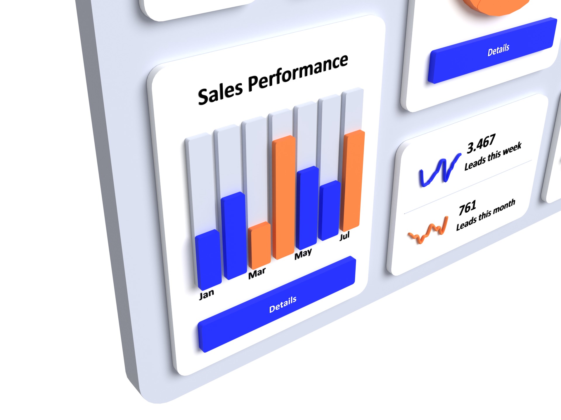

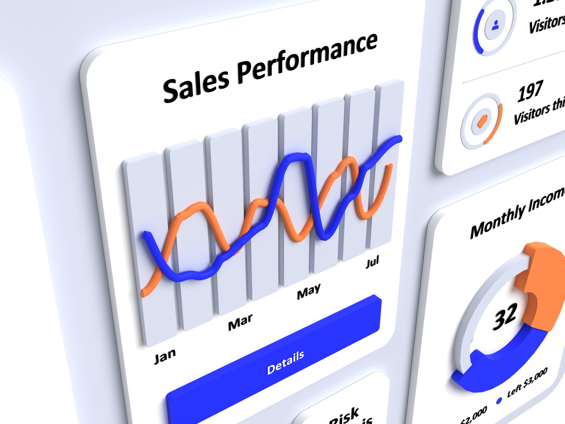


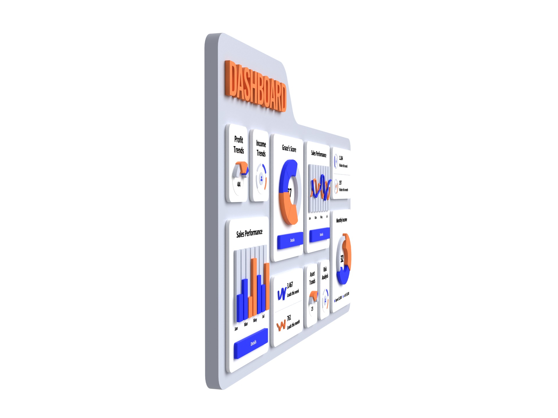

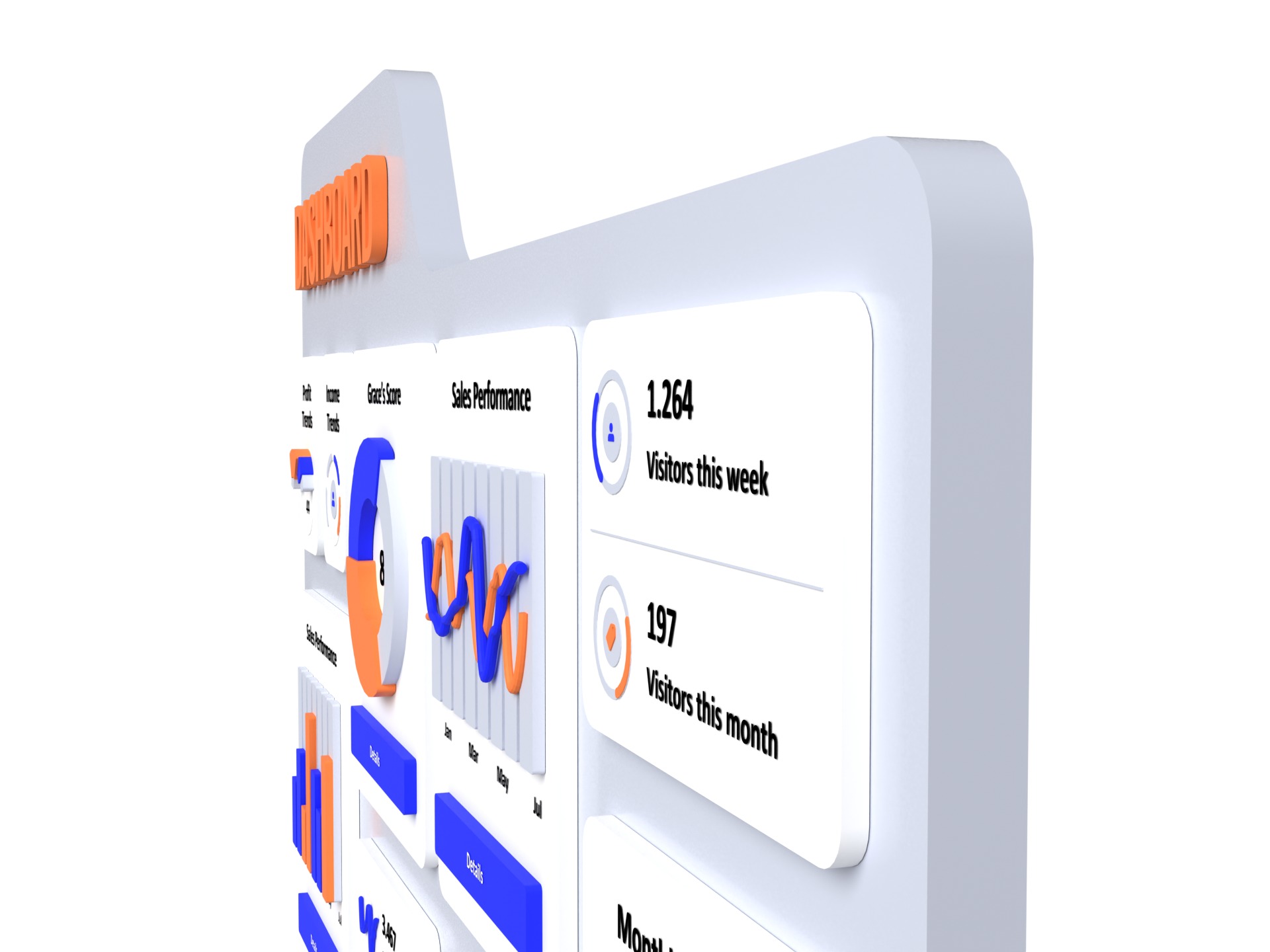


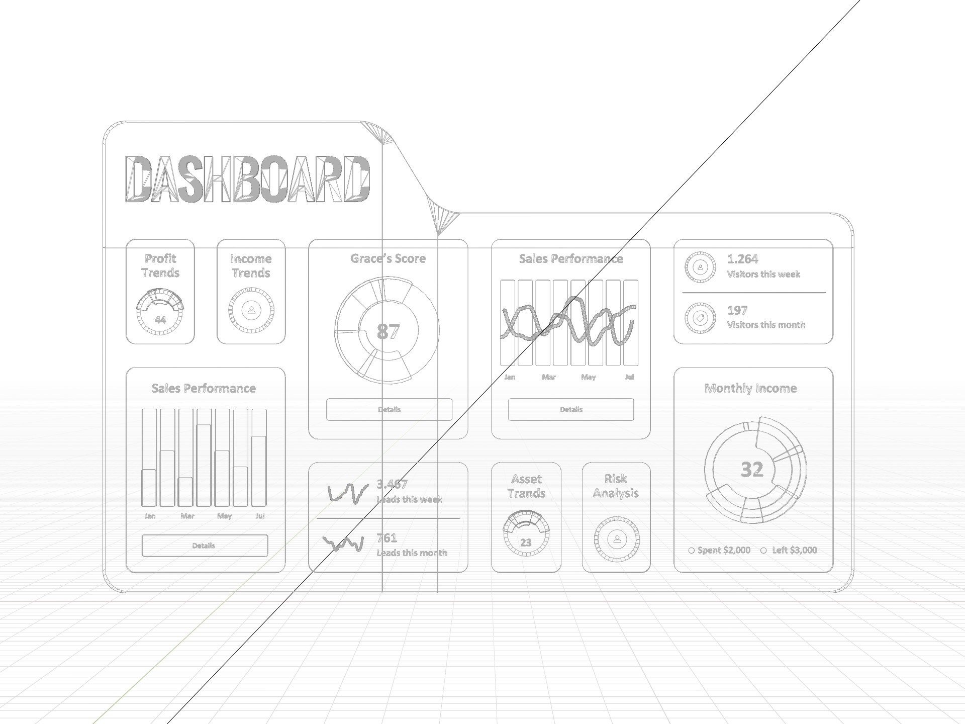


This is a cutting-edge dashboard interface design showcasing essential business metrics and statistics through interactive and visually engaging charts. The interface is structured to provide quick insights into performance trends, helping users make informed decisions. Each element is carefully crafted with a focus on clarity, simplicity, and usability, ensuring an intuitive user experience.
Key Features:
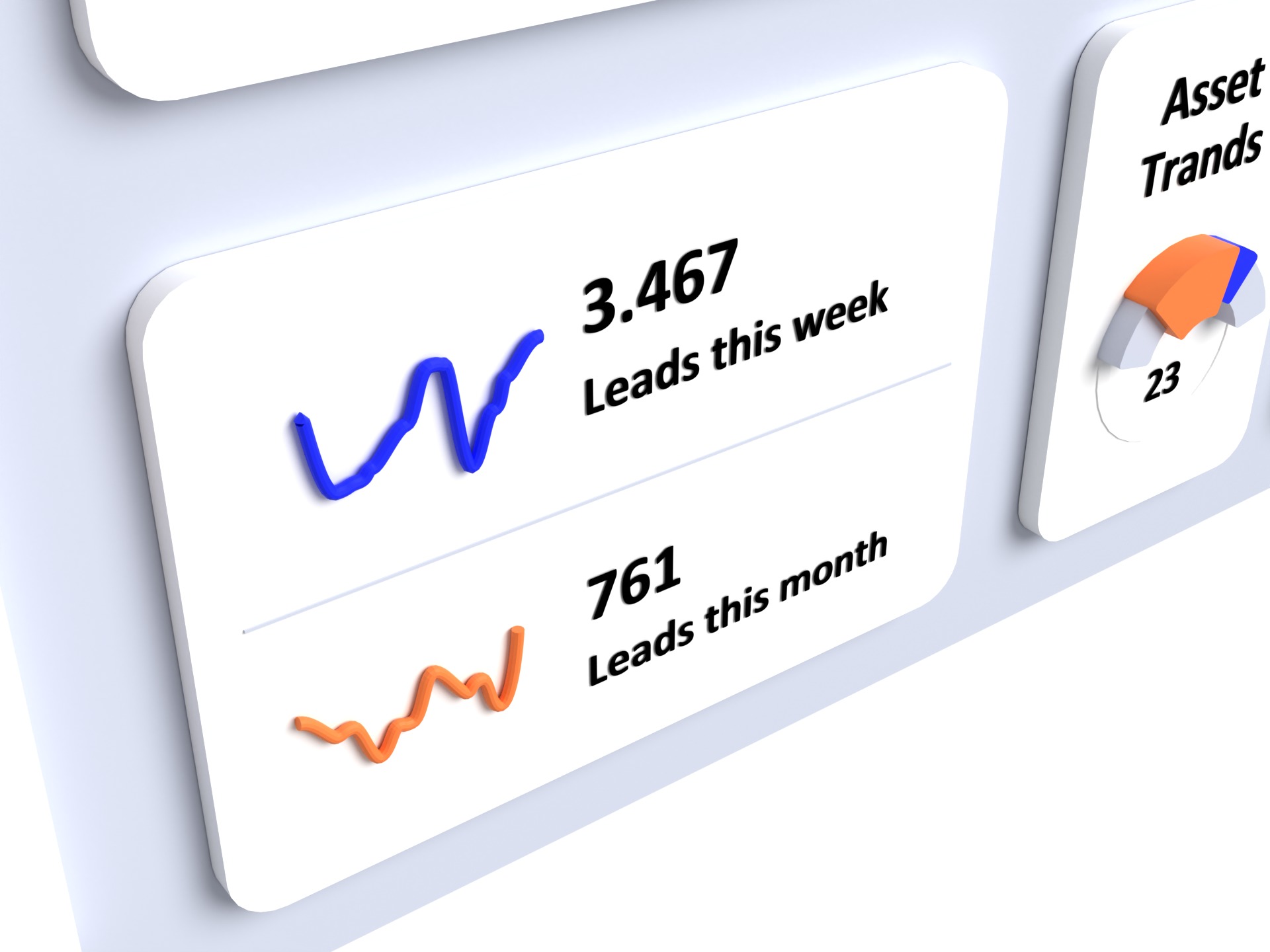
Profit and Income Trends: Represented by dynamic pie charts, these sections highlight financial performance over specific periods.Grace’s Score: A prominent donut chart displays an individual's score, blending bold colors for emphasis and readability.Sales Performance: Featuring dual bar and line charts, this section visualizes sales data across months, enabling quick pattern recognition.Visitors Statistics: Showcasing weekly and monthly visitor counts, these metrics help track website or service engagement levels.Monthly Income: A split pie chart illustrates spending versus remaining budget, providing a clear view of financial health.Leads Trends: Weekly and monthly lead generation numbers are visually presented with waveform charts, helping monitor marketing efforts.Risk Analysis and Asset Trends: Compact donut charts display risk levels and asset flow, aiding in operational oversight.
The 3D aesthetic, combined with a minimalist design approach, creates a professional yet modern look. Each component aligns with principles of user interface (UI) design, ensuring accessibility and scalability across devices.

